

Business Context & Problem
Search was PUMA's silent store. Search users made up just 25% of customers — yet they generated 30% of total revenue and converted at 3× the rate of non-search users. They had the highest intent, the lowest bounce rate, and the clearest path to purchase.
And we were failing them at every step.
The core problem: An invisible search button, an empty overlay with no guidance, and dead-end “No Results” pages created a broken experience at the most critical moment of purchase intent — across 120M+ users in 6 global markets.
Business need
A scalable search system that increases revenue efficiency, supports global consistency, and allows 6 regional teams to optimise autonomously without design bottlenecks.
User need
A clear, guided, and reliable way to find products — one that reduces uncertainty, adapts to intent, and helps recover from errors or empty results.
The evidence that proved it
40% of users abandoned at the empty search overlay — before typing a single character
25% abandoned at "No Results" pages with no recovery path
System delays caused a 7% conversion drop per additional second of load time
6/8 usability test participants couldn't find the search button at all
Regional catalogues (US vs Japan vs India) had no centralised source of truth — leading to irrelevant suggestions and failed queries
Role, Constraints & Success Criteria
I led this end-to-end as the sole product designer — owning research, IA, interaction design, and all key decisions. A UI designer supported the visual layer, and I worked in close partnership with the PM who owned the Search portfolio across the organisation. That relationship went beyond the typical brief-and-handoff — together we shaped the strategy, defined what success looked like, and made the case for investment.
Constraints that shaped the solution
Frontend-only MVP with no backend architecture changes.
Limited engineering capacity and competing priorities.
6 regional teams with incompatible catalogues, different languages, and varying user behaviours
Performance constraints in India and Japan — every extra second of load time was costing 7% in conversion
Hard requirement: post-launch, no regional change would ever need a design request
Before jumping into making screens, the PM and I asked: what does winning actually look like here? We initially framed it as increasing search usage — but shifted to a more precise question: are we making searches better, not just more frequent?
| Metric | Hypothesis |
|---|---|
| Search CTA click-through rate | Making search visible would drive more users into the funnel. |
| Revenue per search session | Better guidance would produce higher-intent searches. |
| No-results bounce rate | A modular recovery system would reduce abandonment at dead ends. |
| Conversion advantage | Expanding usage would not erode the quality of the search audience. |
| Regional content update frequency | Regional teams would be able to operate the system autonomously. |
Research, Strategy & Decisions
With analytics pointing to clear drop-off points but no explanation for why, I needed to understand both the behaviour and the intent behind it. I ran a hybrid research approach — quantitative to find where users were failing, qualitative to understand who they were.
Methods: Analytics deep dive (100K+ sessions across 6 regions, 3-month period), current-state UX audit, journey mapping, competitive analysis (Nike, Adidas, Under Armour + 5 other athletic brands), Baymard guidelines benchmarking, unmoderated usability testing via Maze.


3 user archetypes that helped us empathise with customers
Analytics revealed three distinct search behaviours — and this reframed the entire solution:
Hunters
know exactly what they want ("Palermo black size 9"). Need speed, autocomplete, zero friction.
Explorers
browsing with loose intent ("men's running shoes"). Need guidance, suggestions, categories.
Inspiration Seekers
no clear query yet. Need trending searches, curated entry points, visual context.
The old design served none of them. The empty overlay assumed everyone was a Hunter. This single insight drove the shift from reactive search tool to proactive shopping assistant.
Key insights → decisions
| Insight | We decided to… |
|---|---|
| 40% abandoned at empty overlay — users had no starting point | Show trending searches and category suggestions immediately on open (serve Explorers and Inspiration Seekers from the first second) |
| 25% abandoned at "No Results" — no recovery path existed | Build a modular content block system so every dead end becomes a redirect |
| Catalogue organisation gaps meant no flyout suggestions for valid queries — items existed but couldn't be surfaced | Add a "hit enter to search" state in the flyout so users are directed forward, not left at a silent dead end |
| 7% conversion drop per second of system delay | Design for failure states first — fallback content that works even when the backend doesn't |
| Regional teams had different catalogues, languages, and priorities | Build a flexible system (fixed interaction model, configurable content) rather than a single rigid template |
| Competitive audit: Nike, Adidas all offered autocomplete, trending, guided overlays | We were falling behind market standards — this became a concrete business case for the full overlay |
How might we make search discoverable, guided, and resilient enough to serve three distinct user archetypes — across 6 markets, with different catalogues, languages, and connection speeds — without creating a permanent design bottleneck?
Strategy & design approach
Strategic hypothesis: By making search discoverable, providing upfront guidance through progressive disclosure, and building regional flexibility into the system, we could increase engagement and maintain our 3× conversion advantage — while scaling autonomously across diverse markets.
Design principles (used to guide every decision):
- Anticipate, don't react — Show value before users type anything
- Performance resilience — Design must work even when the backend fails
- Progressive disclosure — Reveal information based on user intent, not all at once
- Global consistency + regional flexibility — Core interaction model is fixed; content is configurable per market
| Fixed globally | Flexible regionally |
|---|---|
| Overlay structure and interaction model | Trending search content |
| Progressive disclosure pattern | Category organisation |
| Fallback states and error handling | No-results content blocks |
| Visual design and components | Language and cultural adaptations |
| Core UX principles | Local A/B testing |
Key decisions & trade-offs
Decision 1: Search as Destination (Full Overlay, Not Embedded Tool)
- What: Transformed search from a header icon into a full-screen overlay
- Why: 90% task completion with overlay vs 70% embedded; 8/8 users understood new model vs 2/8 with old
- Rejected: Embedded header bar — simpler to build, but couldn't provide guidance
- Trade-off: More frontend complexity — justified by data
- Buy-in: “75% of our highest-value users can't find our best-converting flow” — secured priority and budget
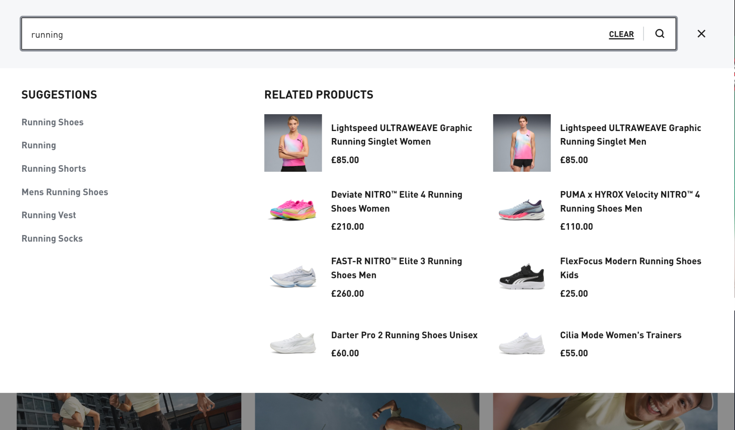
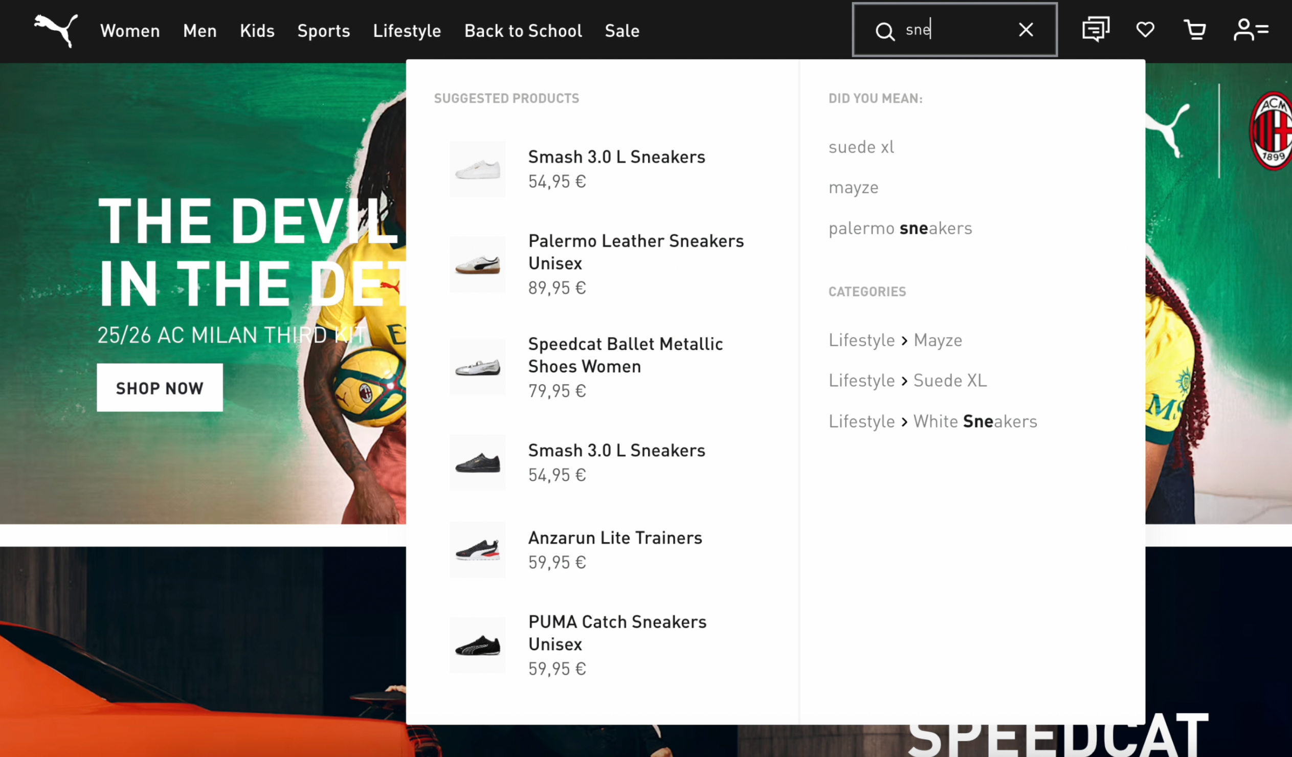 BeforeAfter
Decision 2: Initial Suggestions — From Empty to Guided (0→1)
- Added trending searches + product suggestions or recently viewed (after 3+ product pages visited) to the search activation — PUMA had nothing before.
- Why: 40% abandoned at empty overlay; every competitor (Nike, Adidas, Under Armour + 5 others) had guided entry points
- Rejected: Personalised recommendations (no infrastructure); promotional content (users read it as marketing, not guidance)
- Trade-off: Trending content is global by default — required regional configurability.
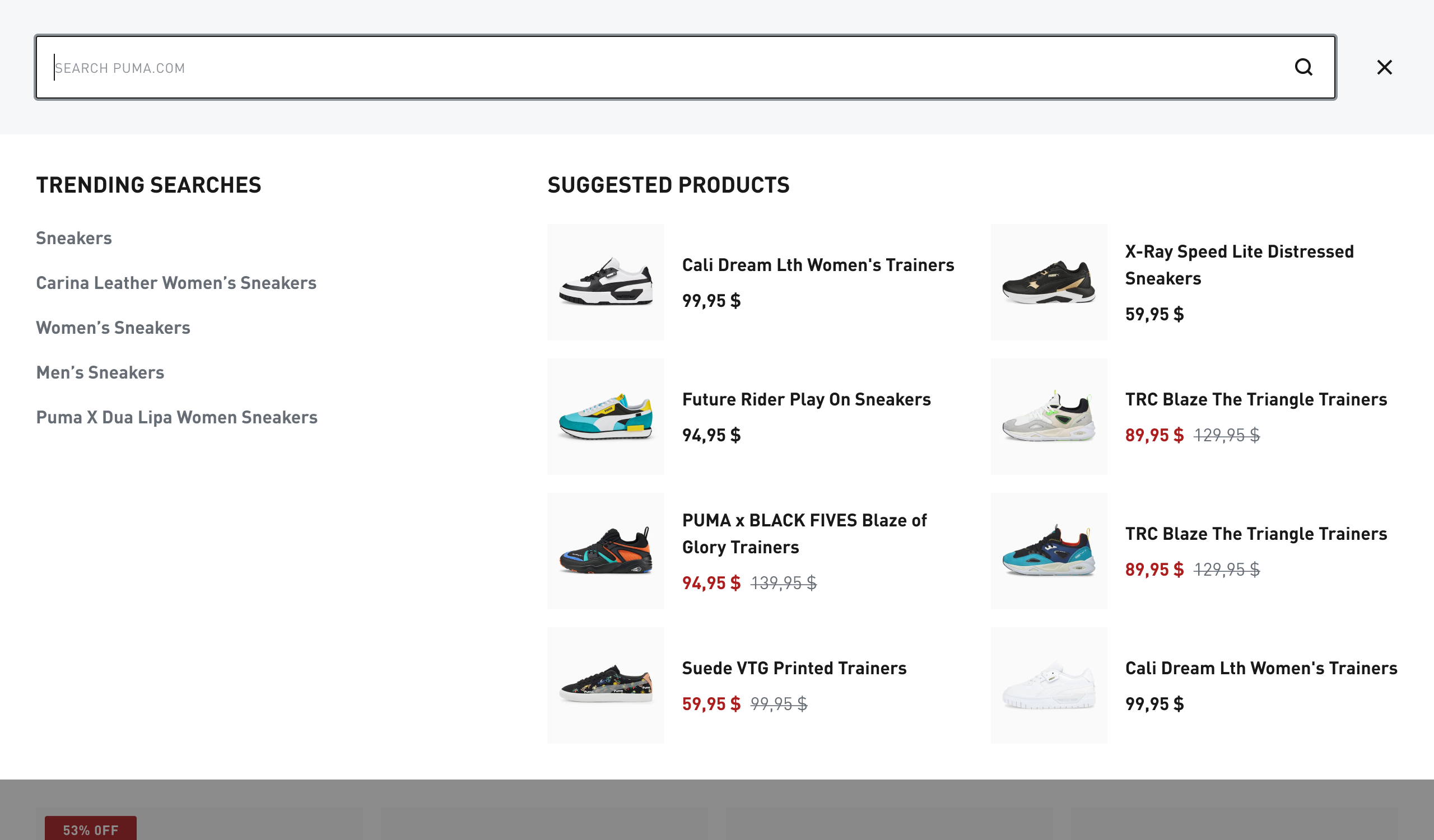
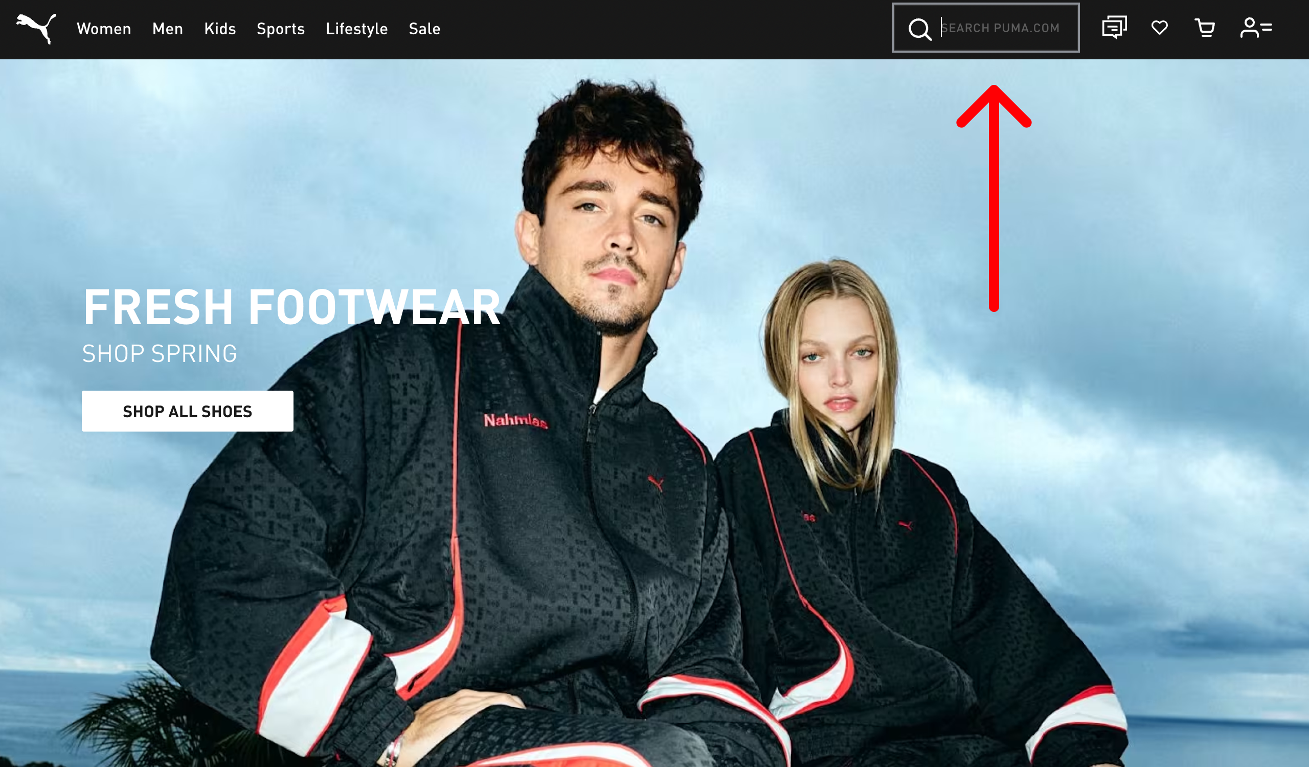 BeforeAfter
Decision 3: Modular “No Results” System
- What: Library of configurable content blocks regional teams mix and match — not one unified template
- Why: US needed product redirects; Japan needed category navigation; India needed support options
- Rejected: Single global template — cleaner, but permanent design bottleneck and wrong for regional diversity
- Trade-off: More components upfront → payoff: zero design requests post-launch, regions own it completely
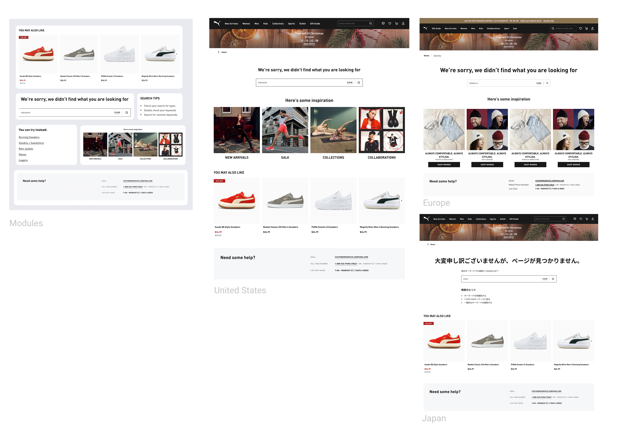
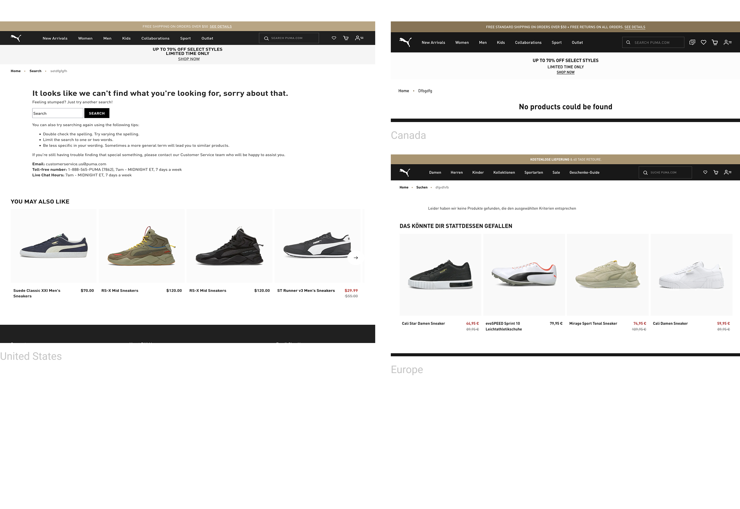 BeforeAfter
Decision 4: List Format for MVP, Chips for Mobile Later
- What: Shipped list-format globally; chips as Phase 2 mobile A/B test
- Why: Usability study (8 participants, desktop + mobile) — desktop clear (3:1 list), mobile split (2:2). On desktop, chips were misread as filters without a header label. Mobile was inconclusive — researcher recommended A/B testing chips + header, which became the roadmap
- Rejected: Chips everywhere (Japan pushed for this — desktop failure); dual patterns day 1 (doubled dev time)
- Trade-off: Mobile not optimal at launch
- App context: Safer to test chips in the app — mobile users on web responded positively, a similar component already existed in the app, and the app uses a separate design system from web (no shared visuals or codebase)

How it reads
Stacked text rows are read as search suggestions on both desktop and mobile.
Result
Shipped globally for the MVP.
Decision 6: Multiple Recovery Paths from a Failed Search
- Why it mattered: Conflating cases 1 and 2 = false promises or missed conversions. Both wrong.
- Trade-off: 3 states instead of 1 — non-negotiable given 7% conversion drop per second and catalogue gaps in all 6 markets

Catalogue gap: Items exist, not indexed for suggestions. “Hit enter to search” — push user forward.

No Results page: Post-search, no matching items. Modular recovery blocks.

Backend failure: API down / slow. Cached trending — flyout always has content.
Final Experience
The final experience was designed to serve all three search mindsets. It gives guidance before input, adapts once intent becomes clearer, and never drops users into an unrecoverable dead end.
Helpful before the first keystroke
Full overlay opens; search field auto-focused; trending searches and category suggestions displayed immediately. Serves Explorers and Inspiration Seekers before they type.
We considered two section types for this state — suggested searches and recently viewed products. Analytics showed users often re-engaged with recently viewed items via on-page carousels, so I proposed surfacing them earlier, directly in the search flyout. The recently viewed section appears only after the user has visited 3+ product pages.
Real-time match to intent
Dynamic suggestions appear in real time; previously viewed items surface; related products shown. Serves Hunters.
Designing past catalogue gaps
Backend is working but catalogue organisation means no suggestions can be surfaced for the query. Rather than showing a silent empty flyout, a "hit enter to search" prompt appears — directing users forward to the results page, where matching items do exist.
Every dead end becomes a redirect
Post-search dead end replaced by modular content blocks: alternative queries, related categories, popular products, regional contact option. Zero abandonment traps.

Outcomes & Learnings
Search users converted at 3× the rate of non-search users — the redesign maintained this even as search usage expanded across all 6 markets.
Dead-end pages were replaced by a modular recovery system, turning abandoned searches into redirected journeys with zero design bottleneck.
Higher-intent searches translated directly into more cart actions — users who found what they came for, acted on it.
More successful searches led to deeper product exploration, increasing session depth after each query.
Specific figures are under NDA. Revenue per search session increased meaningfully — users searched less but bought more, a clear signal of higher intent.
The Growth Story
The headline metric wasn't volume — it was quality. Users performed fewer total searches after the redesign, but revenue per search session increased significantly. This is the clearest signal that the design worked: we didn't just make search easier to find, we shifted user behaviour from casual, low-intent queries to purposeful, high-intent shopping. That's a growth outcome, not just a UX fix.
The counterintuitive signal: users searched less but revenue went up — behaviour shifted from casual queries to high-intent shopping.
What worked
Test decisions, not prototypes
Testing each decision independently made results actionable and built stakeholder confidence.
Build for autonomy
Modular systems scaled impact beyond what I could do alone; 6 markets now run independently.
Negotiate with data
The 30% task completion gap ended every pushback conversation.
Measure behaviour, not just volume
What I'd do differently
Push harder for backend investment
Frontend-only constraints meant designing around catalogue gaps and performance issues that a backend fix would have solved properly; the case for that investment was there in the data.
Qualitative research sooner
Analytics found where users failed; interviews would have found why faster.
What's next
Mobile chips A/B test
Japan first.
Predictive search
Based on browsing behaviour.
AI-powered personalised suggestions
Users already assumed suggestions were personalised in testing; natural next expectation to meet.
